Okay, maybe I'm being harsh with myself but I'm just not happy with my newest creation. In the interest of being honest, I have proof here that I don't always get it right. Anatomy of a swing and a miss:
First I did this sketch, and it came easy and I really liked it.

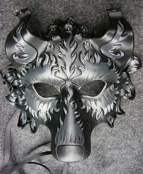
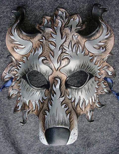
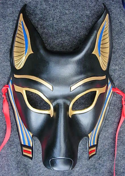
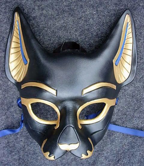
On a totally different note (*changing subject* ) I'm trying an experiment and listing some masks on E-bay. Good time of year for it, and I thought it'd be good exposure to a wider market so...*shrug*. I put up a black wolf, a gray wolf, Anubis, and Bast. Of course in my present mood I'm a bit trepidatious because I know people are often looking for bargains on E-bay and I'm NOT going to play that game...my prices are my prices (though just 'tween us chickens I am setting my reserve below my usual asking price on my personal website...so I suppose someone may see that as a bit of a bargain). They've been up for a day and I have a number of bids on them already, so that's cool I guess. At least people are looking at them. Guess we'll see how it goes.
Keep your fingers crossed. I know it's a little thing really, but to me it's just another thing that could potentially go wrong and I need a little success sometime soon. It'd be nice. :-)
First I did this sketch, and it came easy and I really liked it.
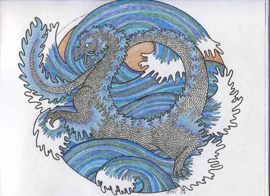
I colored it in nice and bright and thought "jewel tones for a change!", just to get away from the black and do something different. Also, I thought of it as a warm up exercise for the Wave Dragon I'm doing next (I'm shaping the big guy right now, tonight!) which is very very blue-green and vividly jewel-tone-ish.
But! I violated my own cardinal rule, which is "If I can draw it I can build it". Hence the detailed sketches in full color; I know if I like the drawing I'll like the sculpture. Like I said though, I got to work and started changing things right away. Picked a teal suede for the background (mistake), increased the number of fish (mistake), and totally got away from the reed motif. I was intrigued by the idea that this was a little round pond and it was being viewed from above...so wouldn't it be cool to have branches in the foreground like they were hanging over the pool? That was my thought anyway.
But it wasn't in the sketch and so I was winging it, and before I knew it I got carried away with the details of making maple tree branches (which was admittedly a hoot) and I lost the design overall. It just looks like...a bunch of stuff with no coherence and no flow. *sigh*

See what I mean? I lost the point. Even doing different fish patterns was a bad idea, because there was something about the symmetry of three fish with identical markings that really worked in the original sketch. But like I said I got carried away with the minutiae and lost sight of the overall design. Just because I can do really neat stuff with leather doesn't mean I always should...sometimes less is better.
So, not happy. I've been doing pennance and trying to rectify the situation with a second smaller simpler koi plaque. It's better but still not quite right. Did a second sketch too, just to be safe and be sure of the new design, but it's better than the plaque too in some unfathomable way.
*sigh* Maybe I need to step back from it all and just get back to work on my dragons, but NOW I'm a little deflated and unsure of my plaques. *pout* I hate being unsure of myself. It infects everything I do and nothing feels right. Like, right now I hate my hair...why? It's not especially bad hair today, but I hate it.
But! I violated my own cardinal rule, which is "If I can draw it I can build it". Hence the detailed sketches in full color; I know if I like the drawing I'll like the sculpture. Like I said though, I got to work and started changing things right away. Picked a teal suede for the background (mistake), increased the number of fish (mistake), and totally got away from the reed motif. I was intrigued by the idea that this was a little round pond and it was being viewed from above...so wouldn't it be cool to have branches in the foreground like they were hanging over the pool? That was my thought anyway.
But it wasn't in the sketch and so I was winging it, and before I knew it I got carried away with the details of making maple tree branches (which was admittedly a hoot) and I lost the design overall. It just looks like...a bunch of stuff with no coherence and no flow. *sigh*
See what I mean? I lost the point. Even doing different fish patterns was a bad idea, because there was something about the symmetry of three fish with identical markings that really worked in the original sketch. But like I said I got carried away with the minutiae and lost sight of the overall design. Just because I can do really neat stuff with leather doesn't mean I always should...sometimes less is better.
So, not happy. I've been doing pennance and trying to rectify the situation with a second smaller simpler koi plaque. It's better but still not quite right. Did a second sketch too, just to be safe and be sure of the new design, but it's better than the plaque too in some unfathomable way.
*sigh* Maybe I need to step back from it all and just get back to work on my dragons, but NOW I'm a little deflated and unsure of my plaques. *pout* I hate being unsure of myself. It infects everything I do and nothing feels right. Like, right now I hate my hair...why? It's not especially bad hair today, but I hate it.
On a totally different note (*changing subject* ) I'm trying an experiment and listing some masks on E-bay. Good time of year for it, and I thought it'd be good exposure to a wider market so...*shrug*. I put up a black wolf, a gray wolf, Anubis, and Bast. Of course in my present mood I'm a bit trepidatious because I know people are often looking for bargains on E-bay and I'm NOT going to play that game...my prices are my prices (though just 'tween us chickens I am setting my reserve below my usual asking price on my personal website...so I suppose someone may see that as a bit of a bargain). They've been up for a day and I have a number of bids on them already, so that's cool I guess. At least people are looking at them. Guess we'll see how it goes.
Keep your fingers crossed. I know it's a little thing really, but to me it's just another thing that could potentially go wrong and I need a little success sometime soon. It'd be nice. :-)
Tags:
From:
no subject
One of these days I really do need to get my best friend a gray wollf mask. She LOVES masks and wolves, so I know she'd totally squee. I just have to remember XD
...and I haven't really talked to you in a long time, and that saddens me ;_; *cling*
From:
no subject
"...and I haven't really talked to you in a long time, and that saddens me ;_; *cling*"
Waah! I know! I suck...I really do read everyone's LJ every day, but sometimes when I have nothing to add I just can't bring myself to write a "me too" reply so I'm silent. But really, you're part of my daily routine! *smooch*
From:
no subject
From:
no subject
Your masks are freakin' gorgeous! What is your eBay seller ID? Not that I can afford them or anything (*sigh*), but I thought I'd take a peek. :)
From:
no subject
My husband listed them under one of his seller names, zanny14 I believe. :-) That's loads of fun...so far I have a bunch of bids and the auction doesn't end til next Tuesday. *crossing fingers* I really hope it works out because it'd be great to have a new forum for my stuff.
From:
no subject
I still say the plaque is good. BUT it's nothing like your original idea. The sense of tranquility is gone and the colors have changed the feeling. Not a bad thing, though. There is a flow with the fish, it's like they're darting under the branches.
If the project is bothering you, step away from it and push it to the corner of your mind. Dwelling on mistakes won't get you anywhere. That breeds doubt. Later you may have a revelation about the fishies.
*whispers* naked sephiroth...
From:
no subject
But hey...that'd be an interesting idea...a sort of 3-d Escher-like piece all fitted together like a puzzle. Maybe I'll do birds next time. Hmm!
You're a sweetie...I'm just pissed off that I sabotaged myself on this one and I can't shake it now. You know, if a piece fails because of problems with execution or technical difficulties or too much ambition, I can accept that because it's a learning experience, and I know next time I'll do better. But when I do it to myself, when I kick my own ass by second-guessing myself and losing sight of the picture in my head...that feels like a failure to me and it really makes me angry.
It's hard to explain. I know I sound nuts. :-/ This is what I get for being too confident, I don't know how to react when I blow it. I hate hating my own work. It messes with my head.
"*whispers* naked sephiroth..."
Hee! You! With your nekkid bishies and your smexy fanart and your rock 'n roll music and hamburger sammiches...! Seriously, you have to put those links somewhere and share the beefcake with the world (or your f-list) because the pretty guys really dragged me out of my funk last night. *hug* You're the best. :-)
From:
no subject
^^' Yes, whenever anyone is feeling low, I'll be there to throw naked men at them. XD
I will make a sexy post later after I find some more piccies. I'll have to sign out of my account to figure which one is mature rated or not. I swear, DA makes it hard when I can't figure out the rating.
From:
no subject
That makes a very interesting mental image.
From:
no subject
From:
no subject
I best like the fish that swim under the branches, they look more 'included' to me, less flat. Could you maybe make the water wave over them in some way? Oh that just sounds weird when I say it and I don't know how to say it better so...nevermind. I like the more similar white fish of the drawing, too...the different fish in the plaque look a little busy.
The maple leaves are awesome. They'd make gorgeous earrings. @.@
From:
no subject
It's just too much and too little at the same time. There's no sense of composition. Grr...
I liked the maple leaves too, though. I think I still have something there, and making the croggly twisted branches was fun. I'll have to re-visit that sometime after I wash the taste of this one out of my mouth.
From:
no subject
Could you make the fish *dimensional* somehow? Place something under them and curve them up so they look like they're swimming *just* under the surface of the water? That would be so awesome :)
Or maybe the water could have more than one dimension. the wave patterns could be raised or something. Of course, I know nothing about leather, so nothing I say has any technical merit. :/
But even just reverting to something more exact to your drawing in colouring and fish pattern/etc would be great.
From:
no subject
From:
no subject
I'm just putting the fish aside for now. :-/ They frustrate me.
From: (Anonymous)
Swing and a Miss
It's not weasel spit, but no it didn't work. The biggest problem is that it's too busy. There's too much going on - five fish in two colors and five patterns, branches, leaves, waves... There's no sense of unification like the original sketch had. Also, the thing I love about your work is it's dimensionality, and this one is missing that. Even under water you should see the shape of the fish.
The last issue that I see with the composition is that you have a very static arrangement - that particular symmetry of the four fish set around one in the center - *particularly* with the four outside being white and the central one in red has made them even flatter. If you look at your original sketch, the arrangement of three in the same color scheme gives you a sense of the fish swirling around in the water. The five fish layout has no sense of movement.
Now that I've pointed all of that out - accept it as a lesson and move on. If you don't do these things and make mistakes, you don't grow as an artist. Ask me sometime about all the calligraphy pieces that didn't make it off of my drawing board. I've learned more from those than I did from the ones that came out perfectly. Accept the lesson, be grateful for it, and make something beautiful *because* of it.
Eloise
From:
Re: Swing and a Miss
You're absolutely right about the arrangement...I totally blew the composition when I switched from three to five fish and changed the directions they're all heading. It's just dull and flat. :-/ I got so excited by the idea of the maple branches that I started laying things out with branch-space in mind, instead of flow and composition. I HATE it when I sabotage my own work that way...it just makes me angry that I did it to myself.
*shrug* I did get back on the horse today, so to speak, and shaped those dragons. The wave dragon is especially charming...I hope it continues to develop well. I've lost my sense of invulnerability and I'm nervous now that I'll screw up the wave dragon. I already changed a few things with it (but I had to for technical reasons). I actually took your advice and added another leg (it's so cute!) and I took Pat's advice and changed the placement of the tail. Other than that I'm keeping one eye on my sketch and I intend to build the waves exactly as I drew them...no noodling around.
Like I was telling rumdiculous up there, I just get thrown for a loop when I screw up a piece via self-sabotage. I usually have good instincts, so when I listen to them and they fail me, it kinda messes me up for a few days. I'll get over it...I'm just all "grr!" about it right now.
The house-closing thing hanging over my head isn't helping either. *whine* I need a vacation! Or maybe I'll just crack open that second bottle of apple cider you guys gave me... ;-)
From: (Anonymous)
Re: Swing and a Miss
I'm glad that you took Pat's suggestion about the dragon's tail - I think it will make it a much stronger composition. But you're right that the waves are perfect as drawn.
The house closing hanging over you head affects the flavor of *everything*. Remember what a nervous Nellie I was at Pennsic? It's a big, big step, and you can't expect it not to affect you.
I need a vacation too. Or maybe we should crack open one of those bottles - we've got a few left. Or both!
From:
no subject
I feel your pain. For every piece I post and/or print, there are at least ten pieces of shit that will never again see the light of day. And I'm not even proud of everything I post either. Hell, Die vs Crimson....to me, Crimson is crap, while Die just flew out in less than five hours. There are just those pieces that come naturally...and those that you can picture exactly....but they never come out exactly as you picture. :D
As the saying goes - "The greater the artist, the greater the doubt; perfect confidence is granted to the less talented as a consolation prize."
From:
no subject
So now I'm second-guessing ~everything~, which hurts. :-/ I wanted to have fun with my dragons and instead I'm freaking out that I'll ruin them. Still, making them work will go a long way towards making me feel better. Nothing succeeds like success.
BTW I see why you like Die better, but I think there's a lot to love in both pieces. It's good to be objective, but also good to find what's right in everything you do, so you can build on it. Otherwise you end up cutting off your ear a la Van Gogh...
From:
no subject
No no no no no no no....you are not whining. All artists go through periods of self-doubt. It's how we learn to cope with our own inner demons; learning that we all make mistakes...it's how we grow in our art and move forward. We all need to vent a bit of we're having issues... :D It's not whining, it's bitching. There's a difference. XD
But you're right. The only way to overcome the second-guessing is to keep working and keep moving ahead. And eventually you'll get back into the swing. I wouldn't worry about your instincts failing you once in a while... they can't be 100% all the time. XD We'd have to start wondering if you were really human. ;)